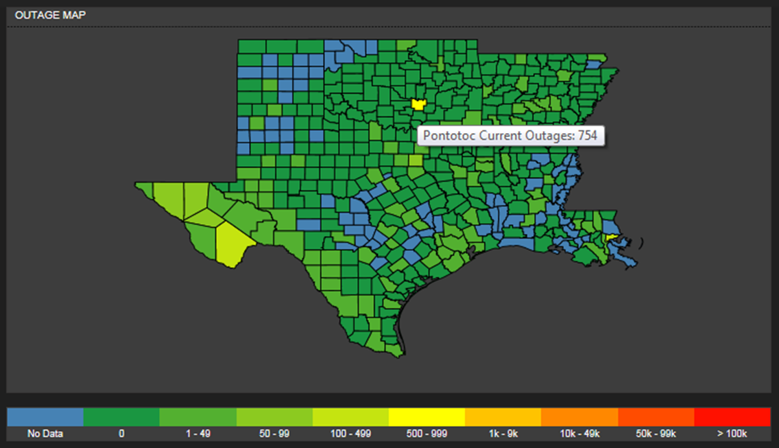
Map View
The map panel provides a geographical representation of customer outages. The overview map allows easy identification of national
“hotspots”. Clicking on a State updates the map view and associated tables, trends, and status views to reflect information
at the county level for the selected State.
Hovering over any of the features on the map shows details of the customer outages in that State or county.
|
|
|
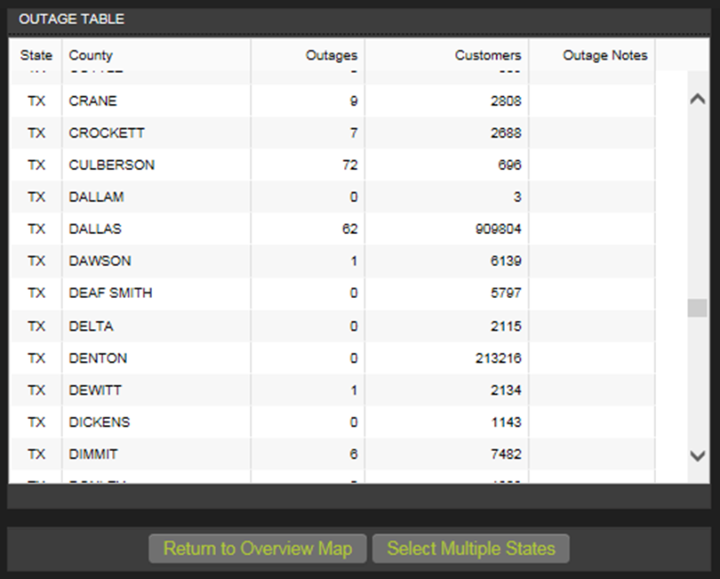
Table View
The table panel provides a tabular representation of outages consistent with the currently selected Map view. This panel also controls
navigation of to the overview map and table and also allows for the selection of multiple states.
The table can be expanded to display more states or counties rows and also additional data columns. Most columns can be sorted as well.
Additionally, the Multi-State button allows for the selection of any number of States which will be shown in all of the
views in the dashboard. The Overview button takes you back to the National view.
|
Trend View
The trend panel provides a historical representation of outages for the State(s) currently being viewed.
Up to 30 days of daily maximum outage history is displayed.
You can hover over any data point on the chart and it will display the date and maximum outage for that day.
|

|
|
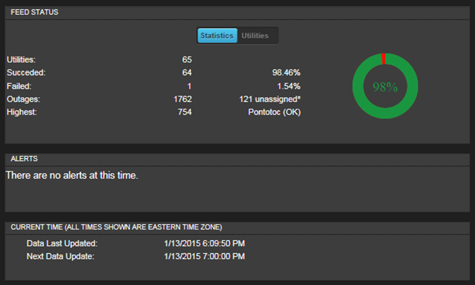
Status View
The status panel provides general statistics related to the latest data pull and includes a detailed Utility listing of feed status and outages.
It also shows the breakout by utility type (investor owned, cooperative, municipal, other) of the selected data set.
A listing of the actual utilities with associated data can be viewed by clicking the expand icon. The expanded window
shows data for each utility based on the selected view.
|